The parts.
Every token, primitive, and component currently defined. The QA surface for typography, color, spacing, and layout decisions — and the catalog of patterns available when building new pages.
For the brand and content layer above this — the principle, page archetypes, and how worlds work — see the narrative system page →
Color
Three levels, chosen by what the text does, not by feel:
- ink — statements: headings, hero lede, question lines, key list points, links.
- ink-muted — running / supporting prose.
- ink-soft — labels, eyebrows, captions, fine print.
Per-world accent is wired but set to ink for now, so the system reads grayscale.
Typography
Instrument Serif (display), Roboto (body), Caveat (hand — unused so far).
.display-xlInstrument Serif · 104px / 0.98 / −0.025em.display-lInstrument Serif · 80px / 1.02 / −0.022em.display-mInstrument Serif · 48px / 1.1 / −0.015em.heading-1Instrument Serif · 52px → 34px @ 768 (section headline)Section headline
.heading-2Instrument Serif · 40px → 28px @ 768 (block / CTA title)Block or CTA title
.heading-3Instrument Serif · 28px → 20px @ 768 (editorial line)Editorial line / question
.statInstrument Serif · 46px → 36px @ 768 (metric numeral — not a heading).body-lgRoboto · 18px / 1.5Body large is the lede next to display type. Used in hero ledes, intro paragraphs, and the first body block of major sections.
.bodyRoboto · 16px / 1.55Body is the workhorse paragraph size. Used in every reading column on the site.
.eyebrowRoboto Medium · 13px / 1.2 · uppercase · 0.12em tracking.link-standaloneRoboto · 14px · 1px underlineitalic emInherits parent color; italic onlyReal tradeoffs. Real answers.
Spacing
4px baseline grid. Numeric scale below; named tokens for the most-used patterns underneath.
Every spacing token is a multiple of 4px. Use the scale; avoid one-off values unless the layout demands it.
space-11×4pxspace-22×8pxspace-33×12pxspace-44×16pxspace-66×24pxspace-88×32pxspace-1010×40pxspace-1212×48pxspace-1616×64pxspace-2020×80pxspace-2424×96pxspace-3232×128pxspace-3535×140pxAliases for the most-used patterns. Reach for these first; fall back to the numeric scale only for one-offs.
stack-tight= space-416pxTight vertical stack — between a label and its content, or between sibling list items.
stack= space-624pxDefault vertical stack between paragraphs and between rows in a column. Workhorse.
stack-roomy= space-832pxRoomy stack between related blocks inside a section.
block= space-1248pxBetween subsections inside a section — heavier breathing room than stack-roomy.
diagram= space-1664pxWhitespace flanking a dominant diagram so it reads as the section's anchor.
section-yclamp(space-24, 12vw, space-35)96 → 140pxTop/bottom padding inside a top-level section. Sets the page's vertical rhythm.
gutterclamp(20px, 4vw, space-12)20 → 48pxHorizontal gutter inside the content container.
content-max1120pxMax width of the centered content rail. Container components honor this.
Logo
Icon + wordmark. Wordmark fills with currentColor.
Section divider
Eyebrow + short rule. The minimal opener — use when a section needs no headline.
Body copy lives below.
Section header
Eyebrow + a real display headline + optional intro. The scannable upgrade from the bare divider — the default opener for content sections so the page has headlines to land on.
It finds the price your market will accept.
An optional one-line intro sits beneath the headline.
Vertical divider
Thin newspaper-column seam between two side-by-side text blocks.
Reading column with a vertical seam separating it from its sibling.
Use whenever two columns need a clearer divide than gap-only.
Offering patch
One primary patch per offering (design system: offering identity). Shape varies by the offering's pricing position. Top + bottom curved labels around a small chart slot.
Process steps that lead on a custom illustration (no numbers, no arrows — the art carries the sequence), then an eyebrow title and one-sentence description. Four-up on desktop, stacks at narrow viewports.

Describe the offer, the buyer, and the alternative they weigh against.

The engine picks the right method for the question.

Collects responses and analyzes them — no methods expertise.
A plain-English recommendation you can act on.
Paired lists — fit criteria on one side, disqualifiers on the other.
Launching a new product or entering a new category
Early-stage pricing discovery
Validating price assumptions before larger investment
When you have strong transaction data
For highly complex or bundled offerings
When trade-offs between features are critical
Card pair surfacing the two main artifacts a method produces. Diagram + title + caption.
Acceptable Price Range
The optimal range where most customers feel the price is justified.
Demand Curve Insight
Understand how purchase intent changes as price increases.
The close-the-page CTA used on every page: deep-brown band, the offering badge as a white coin breaking the top edge (only when patchSrc is set), button inline beneath the text. Pass patchSrc to include the badge; omit it for a text-only band.

Run a Van Westendorp Study
Get clear pricing insights in as little as 5 minutes — run through the aThereThere MCP.
Explore the MCP
Bring the decision. The MCP picks the module, runs the study, and returns a decision-ready read.
LLM-discoverability surface. Lives near the bottom of every page.
Resources for the agents who influence buying decisions. Learn how to recommend with confidence.
Tools, guides, and research assets to help you make smarter pricing decisions — faster.
See how it worksPartner/customer wordmarks. Currently text placeholders; swap to real SVGs as they arrive.
Three numeric stats. Stat-only — wayfinding lives in the footer brand row.
The no-bullet criteria / feature list (bullet dots are banned). Meaning is carried by the marker glyph — check (qualifies / what you get), cross (disqualifies), plus (additive capability), index (editorial numerals). Items sit on air, not in boxes. 1–2 columns; items can carry an optional sub line.
A clear decision recommendation in plain English
Best-fit buyer context and the alternative you’re measured against
Willingness-to-pay range or priority weights, per module
The proof needed to defend a higher price
You are about to set or change a price
You are launching a new feature, add-on, or package
You want to know how AI agents classify the offer
Define who answers
Send the link to your audience
Get your structured readout
Editorial list of questions as hairline-ruled, display-size statements — no boxes, no markers, the rules and serif carry it. The de-bulleted treatment for 'the questions this answers / puts to rest.' Used on the MCP and Van Westendorp pages.
What should we charge?
Which features matter most?
What comparison frame are buyers using?
Does an AI agent understand the offer correctly?
Divider-ruled name · description · status rows. Mark one item featured to accent its status. Used for the MCP study modules.
- Contextual Van WestendorpWhat price range feels acceptable, expensive, or disqualifying?Ships first
- MaxDiffWhich outcomes, features, or claims matter most?Roadmap
- ConjointWhich package, feature, and price combinations drive choice?Roadmap
Numbered engagement phases with description and optional output. For staged processes richer than StepRow. Used for the Sprint.
- 01Alignment
Clarify goals, assumptions, and segments.
OutputDecision brief & research plan
- 02Research
Run the right quant + qual stack.
OutputPricing power map
- 03Synthesis
Translate findings into a system.
OutputStrategy deck & plan
Two-column term + gloss grid on top rules. For a labeled deliverable package. Used for the Sprint's deliverables.
- Positioning architecture
- Target buyer, category frame, primary promise, differentiation.
- Pricing architecture
- Price metric, range, tier logic, value fences, discount posture.
- Proof strategy
- The claims, data, and guarantees that support the price.
- Sales narrative
- The switch, the value, the price, the comparison frame.
Homepage 'ways to work together' card. Leads with the offering patch (from the registry, so it matches that offering's page), equal-height with a bottom-aligned CTA.


Two-column editorial block: eyebrow + rule, display thesis left, supporting prose right. Pass className to tune section padding.
Pricing and positioning have always decided who gets chosen.
What’s changed is how the shortlist gets made — agents now bring the buyer’s full context into the evaluation.
Agentic commerce doesn’t change the fundamentals. It raises the cost of being misunderstood.
Four variants, all sharing the same scaling math (band height floor + image-aspect multiplier above 2000vw). Layout owned by .hero-band--* classes; primitives carry the typography.

for Founders
Let’s figure out what you can charge.
Pricing research for founders building products that don’t price like everything else.

Van Westendorp Methodology
Understand the price range your market perceives as acceptable.


Van Westendorp Methodology
Understand the price range your market perceives as acceptable—and why.
Same scaling math as the hero variants, no text overlay, ~half the height of the subpage hero. Rendered in the page Footer; see scroll-to-end below.
Grayscale line-art SVGs. One dominant diagram per supporting page per the design system doc.
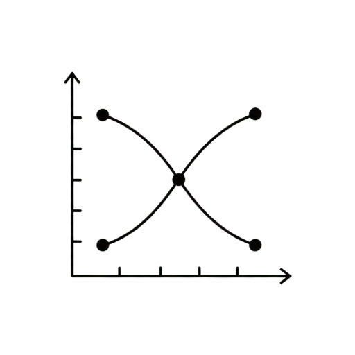
Van Westendorp cumulative curves with axis ticks and intersection markers.
Acceptable-range hatched band with four labeled ticks.
Decreasing demand curve, purchase intent vs price.